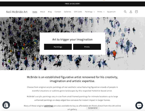
Neil McBride Art gets a makeover.
Share
Welcome to my newly redesigned website!
As an artist, I understand the importance of creating an online space that not only showcases my artworks but also provides a seamless and enjoyable experience for visitors. In this blog post, I will walk you through the exciting changes and improvements I have made to my website, focusing on the enhanced navigation and the emphasis on my artworks.
Why did I redesign my website?
Redesigning my website was a necessary step to better connect with art enthusiasts and provide them with a more engaging experience. The previous version of my website failed to highlight my artworks effectively. I wanted to create a platform that truly reflects my artistic vision and allows visitors to explore and appreciate my creations effortlessly.

Enhanced Navigation for a seamless experience.
One of the key aspects of my website redesign was improving the navigation.
I wanted visitors to easily find their way around and discover the different sections of my website. To achieve this, I have added two large buttons over the first image on my Homepage to take you straight to my paintings or prints.
I have also de-cluttered the navigation bar to give a more user-friendly menu that categorises my artworks based on themes and collections.
Whether you are interested in original paintings or prints on canvas, paper and metal, you can now effortlessly navigate through the various categories and explore my diverse portfolio.
Additionally, I have incorporated a more prominent search functionality (see the magnifying glass on the menu bar) that helps you to quickly find specific artworks. Simply start typing and predictive text will guess what you are looking for. A small improvement that actually works.
This feature saves time and ensures a more personalised experience for you.
Emphasising my artworks.
With the website redesign, I wanted to put my artworks front and centre. Each artwork still has its own dedicated page, allowing you to immerse yourself in the details and stories behind each creation.
Furthermore, I am adding "Featured Artwork" and "New Arrivals" sections on the homepage, where I will try to regularly highlight new and interesting work.
I am also exploring the idea of adding more testimonials from happy buyers of my work so please email me if you are more than happy with my work and service. I will, of course, preserve your anonymity. If you have any negative comments I would dearly love to have those too so that I can up my game! Please forgive me if I don't publish them though.
Would you like to see more "behind the scenes" photos and writings? Please let me know. Maybe I can reward you with a little doodle as a thank you.
Email me at neilmcbrideart@gmail.com
Engaging and interactive features
In addition, I have dispensed with the clunky social media sharing buttons on the products pages and replaced them with a Share button so you can easily copy and paste the web page address (URL) allowing you to easily share your favourite artworks with your friends and followers.
I hope this feature encourages art enthusiasts, like you, to connect and engage with my work.
Conclusion
With this more elegant redesign of my website, I feel I have created a chic, visually engaging and more user-friendly platform that truly showcases my artworks.
Thank you for your time.
All the best
Neil